Thursday 14 April 2011
Starbucks logo update
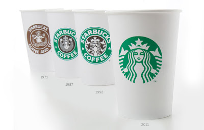
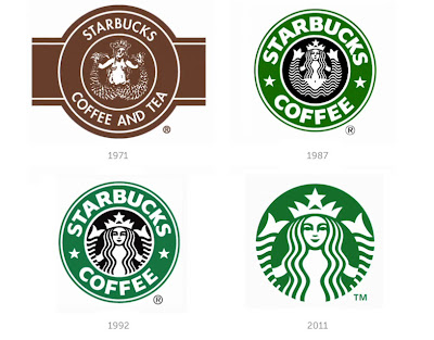
In march 2011, the most powerful brand in coffee, Starbucks, started using a simplified logo to coincide with the 40th anniversary of the company. The new logo does away with the Starbucks coffee' text and the outer ring, leaving only the siren in green. Starbucks are now like Nike with their logo, they've been around for so long now, and are so big, that everyone knows them and there's no need for the text on the logo.
"The result is an evolved logo that celebrates the siren in a much bolder way - it's more expressive and energetic and still uses the same vibrant green circle that is so well recognised by our customers around the world"
Mike P., Senior Creative Manager, Starbucks
I totally agree with the Senior Creative Managers thoughts on the new logo, they managed to change and improve it, by keeping the only part of the logo that was really needed anymore.
designboom
Subscribe to:
Post Comments (Atom)


No comments:
Post a Comment